KAMİS
Home
Principle
Description
In previous years, it was highly emphasized that all the elements on the homepage should be in the vertical axis and in the visible area of the page. This rule, which was valid during the early days of internet usage, has evolved with the development of technology that has become more integrated into daily life. The visible area of the homepage remains important today, but the necessity to fit all the elements on this page within the visible area has become less crucial.
Research has shown that the majority of users scroll through the page. Data obtained from 2 billion page visits revealed that 66% of users focus on the section of the page below the first visible area. Data from approximately 100,000 page visits also showed that 76% of users scroll down, and of those users, 26% scrolled all the way to the bottom of the page.
Guidelines
- Primary navigation components should be positioned in the area that appears on the screen without the need for scrolling.
- Depending on the design and content density, a vertical scrollbar can be used when necessary.
- When a scrollbar is used, the length of the page should not exceed the equivalent of 4-5 main screen pages, and the order of importance should be designed from top to bottom.
- Important content that is intended to catch the user's attention and is important from the user's perspective should be placed in the upper sections of the page.
- By applying simple and minimal design principles, a website can appear correctly on devices with various screen sizes and resolutions.
- In page designs that require scrolling, attention should be paid to the use of elements that create the perception of the page ending vertically. Elements that create interruptions in the vertical direction or give the impression of the end of the page can cause the content in the lower section of the page to be overlooked.
References
Useful Resources
Significance Level
Example
Principle
Description
Guidelines
- The homepage title should be named with a short description that is search engine-friendly and understandable when bookmarked by users, and the term "Homepage" should not be used.
- Basic operations and frequently used links should be included.
- Corporate news, events from management, congratulatory messages, and similar components should not outweigh the importance of the main content.
- The most important operations should be emphasized on the homepage to provide a clear starting point for users.
- The purpose of the website and what users can do should be clearly understood from the homepage. For this purpose, user persona studies can be used as guidance.
The homepage should have a significantly different design compared to all other pages on the website.
The website should not be considered independently of the organization; it should maintain consistency with the corporate identity. - Information related to the organization's internal matters and employees should not be published on the corporate website. Such information should be shared on the organization's intranet portal.
- Some elements on the homepage should not be repeated multiple times to emphasize their importance; all unnecessary elements should be removed from the homepage.
Instead of providing a link on the homepage for users to access the search page, an internal search box should be included on the page. Searches made from the homepage should cover the entire site content. - Visual elements should be used to display real content on the homepage, not for decoration purposes.
- Animations should only be used when necessary. Using animations on important page elements can create an advertising perception, distracting users.
- If important parts of the website or the entire site are not working, this information should be clearly provided to users on the homepage.
- Information such as search engine, design company, browser information, or technological infrastructure, which does not attract the user's attention and is just a waste of space, should not be included on the homepage.
- For time-bound content like news or announcements, date and time information should be displayed. If the website cannot be updated frequently, it is advisable to avoid using components that include date information.
- In websites targeting multiple countries, the time zone should be indicated according to the target audience.
- The website should have a dynamic structure that is actively updated based on the needs of the target audience.
- The weight and significance of the graphic components used should not overshadow the content.
- Components used should take into account browser loading performance and bandwidth usage, avoiding content that takes too long to load or cannot be displayed.
References
- ISO 9241-151 / 8.3.8 – Informative home page
- ISO 9241-151 / 6.11 – Identifying the website and its owner
Useful Resources
Significance Level
Example
Principle
Description
Guidelines
- The use of long texts on the homepage, which requires the use of a scrollbar, should be avoided because it leads to skipping content without reading or wasting time to find the desired information.
- The homepage should only contain essential headings and short content that aligns with the purpose of the website. When text is strategically necessary, it should be as short as possible and well-segmented.
References
- –
Useful Resources
Significance Level
Example
Principle
Description
Guidelines
- Consider that including a large number of links on the homepage can make the homepage look cluttered and reduce the usability of the website.
- Ensure what aspects will be selected for the homepage and the importance of the options and links presented for the site.
References
- ISO 9241-151 / 8.3.9 – Directly accessing relevant information from the home page
- ISO 9241-151 / 8.4.9 – Providing cross linking to potentially relevant content
Useful Resources
- –
Significance Level
Example
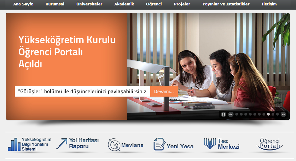
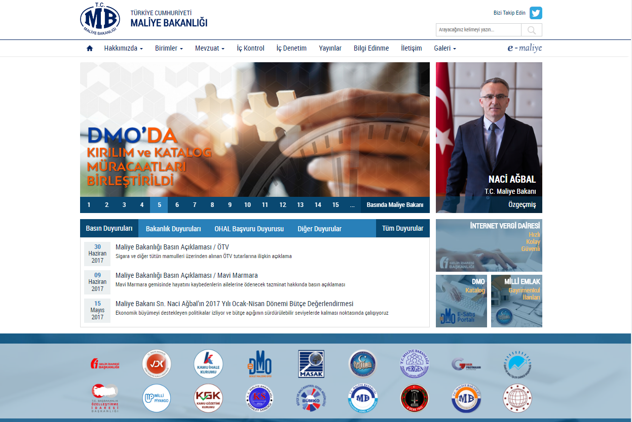
In the example site, access to frequently used content (below the image slideshow) is provided directly from the homepage.
Principle
Description
Guidelines
- To ensure easy access to the homepage from every page on a website, a link labeled "Home" should be provided.
- On subpages, a breadcrumb structure should be used to save time and offer quick access.
- Users should be able to navigate to the homepage by clicking on the organization's logo, but this method should not be considered the sole means of returning to the homepage.
- After completing a sequence of steps in a task, users should not be automatically redirected to the homepage. Instead, on pages where sequential steps are required, it is advisable to stay within those sections considering that the process may need to be repeated or another function within the subsection may be needed. However, the option to return to the homepage should still be available from these sections.
References
- ISO 9241-151 / 6.11 – Identifying the website and its owner
- ISO 9241-151 / 8.4.11 – Linking back to the homepage or landmark pages
Useful Resources
Significance Level
Example
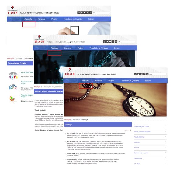
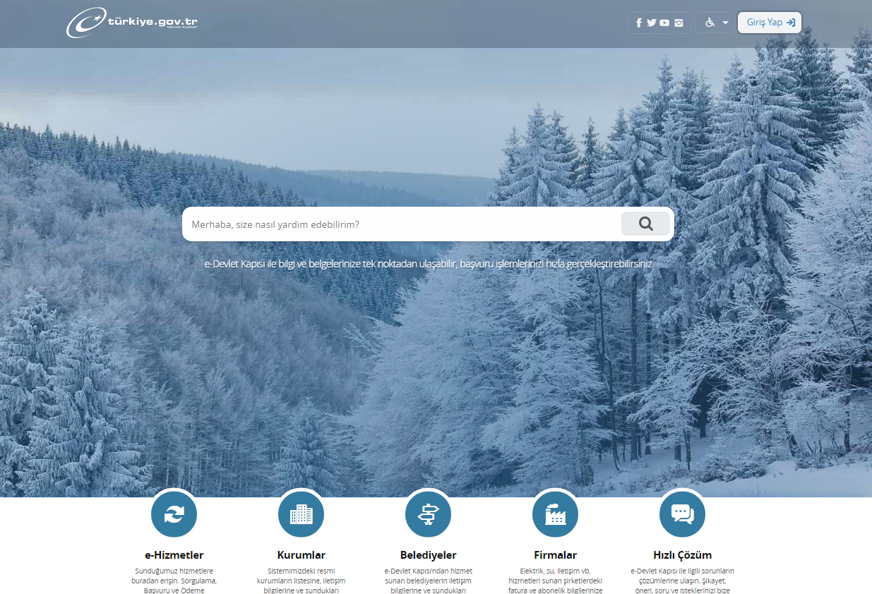
In the example site, a "Home" link is provided to allow users to access the homepage from different subpages.
Principle
Description
It is known that users often use the homepage to access content within a website. Websites that make a positive first impression are perceived as more reliable and usable by users, leading to higher user engagement. Websites are rapidly evaluated by users, primarily relying on automatic and quick assessment processes. The more effort and attention required by the second-level evaluation process, the lower the initial positive perception by users.
Websites are evaluated by people at two different levels. At the first level; there is an involuntary, automatic and very fast evaluating system that perceives simple relationships and patterns very quickly. At the second level, there is a system that works slower and requires more effort and at the same time requires our attention. Websites are evaluated very quickly by the first level system based on previous experience. The more the site appearance requires attention and effort at the second level, the lower the level of positive perception on the user side.
In the researches conducted, it has been observed that the areas that users focus on the most are; logo, main menu, search box, social network links, general appearance of the site, written content and sub-section of the site.
Guidelines
- The website should be able to provide who it is, what it offers, and why it's essential for users within the first few seconds.
- It's crucial to remember that users initially scan the site with their eyes, not read it.
- The website should have a clear, distinct, and well-designed logo that aligns with corporate identity principles.
- It should have an understandable and user-friendly navigation structure.
- Contact information should be easily findable and accessible.
- The website interface should be visually balanced. Grid systems available online for free can be used for this purpose.
- The use of different colours and fonts should be limited. The use of more than 4 colours and more than 2 fonts may create a rainbow effect on users and create a negative aesthetic and visual chaos perception at first.
- Elements for initiating actions (e.g., buttons, links, etc.) should not be equally emphasized. Their importance should be visually communicated, ensuring users can grasp their significance at a glance without causing cognitive strain.
- "5-second tests" can be conducted on web pages or screenshots.
- Images on the homepage should support the organization's mission, but the image itself should never overshadow the organization.
References
- ISO 9241-151 / 8.3.8 – Informative home page
Useful Resources
- First Impressions Matter: How Designers Can Support Humans’ Automatic Cognitive Processing
- Why First Impressions Matter
- First Impressions Matter: The Importance of Great Visual Design
- Eye-tracking studies: first impressions form quickly on the web
- The role of visual complexity and prototypicality regarding first impression of websites
Significance Level
Example