
KAMİS
Device Independent Design
Principle
Description
Guidelines
- When accessed from different devices like computers, tablets, and phones, elements on the website should adjust according to screen width and be displayed smoothly without the need for horizontal scrolling.
- In responsive design, page elements are constantly changing, so design and development teams should collaborate closely.
- A website designed according to responsive principles can offer an excellent user experience on a desktop platform but provide a poor experience on mobile devices. Usability testing should be conducted for each layout change.
- Users should not be forced to use the website in full-screen mode.
References
- ISO 9241-151 / 7.2.2 – Independence of content, structure and presentation
- ISO 9241-151 / 9.3.14 – Using appropriate techniques for defining the layout of a page
- ISO 9241-151 / 10.9 – Designing for input device independence
Useful Resources
Significance Level
Example
Principle
Description
Guidelines
- The website should be designed to be compatible with all resolutions, even if the visual design may be affected, a structure should be built where navigation and functionality remain unaffected.
- Information about which resolution and browser works best for the website should not be provided directly on the homepage. However, this information can be provided in technical details or a help section.
- Considering that users without visual impairments generally prefer to read text from 60cm away at 12 points, and that screen sizes between 14-24 inches are more commonly used, these factors should be taken into account.
- Designs should consider the resolutions of commonly used devices, especially since many users access websites through tablets or mobile phones.
- It should not be assumed that users are required to use websites in full-screen mode, and screen designs should take this into account.
References
- ISO 9241-151 / 10.7- Supporting common technologies
Useful Resources
- Galitz, W. O. (2007). The essential guide to user interface design: an introduction to GUI design principles and techniques (3rd ed.). Indianapolis, IN: Wiley.
- Screen Resolution and Page Layout
Significance Level
Example
Principle
Description
Guidelines
- To prevent the slowness experienced during page loading, large content files (e.g., photos, videos, animations, etc.) should not be used.
- Images, except in exceptional cases, should not be used in their original large sizes but should be resized to fit the screen size. To reduce image sizes, image editors should be used to adjust their dimensions. HTML/CSS should not be used to change the real size of images/photos.
- Optimizations/improvements should be made, especially for the homepage and frequently used pages, to ensure that they load quickly.
- The maximum wait time for page loading should not exceed 10 seconds.
- Gradual loading techniques can be used to load pages in stages. With this technique, the first part of the page will be immediately available for the user to start reading.
- Pages should be optimized for low connection speeds as well.
- JavaScript, CSS, etc. files should be cached by using full-length source code within the page rather than being included in each page, using common server folders.
References
- ISO 9241-151 / 10.5 – Acceptable download times
Useful Resources
- –
Significance Level
Example
Principle
Description
User-owned operating systems can vary, making it crucial that websites are designed to work seamlessly on all operating system-based browsers (e.g., Windows, MacOS, Linux, etc.).
Operating systems may interpret fonts or form elements differently. The reason the same font may appear differently on different operating systems is due to the different rendering engines used. The same font might be displayed with anti-aliasing in one operating system while in another it may appear sharp-edged and more jagged due to the lack of this feature. When form elements are used in their standard, uncustomized state without web technologies (CSS, JavaScript, etc.), differences in appearance can also arise.
Guidelines
- A smooth operation test should be performed with browsers in the national open source operating system.
- Regardless of the operating system, the website's appearance, content, and performance should remain consistent.
- Plug-in file types that are not available in every operating system and require paid applications should not be used within the scope of document downloading, and common extension types should be preferred.
- It should not be assumed that users use a specific operating system.
- In the font preference, the different font appearance that will be created by the interpretation engines in different operating systems should be taken into account and the most ideal font should be selected for the target audience.
References
- ISO 9241-151 / 10.7 – Supporting common technologies
Useful Resources
Significance Level
Example
Principle
Description
Guidelines
- Since it is impossible to know with certainty which browser users will employ, the website should be designed to have the same appearance and performance on the most commonly used browsers (e.g., Google Chrome, Internet Explorer, Mozilla Firefox, Safari, Opera, etc.).
- The use of special browser components (e.g., components, plugins, etc.) can affect the appearance of websites and should be considered.
- Designs based on special plugins or features found in the latest browser versions should be avoided, taking the website's target audience into account.
- Components that strain the processor power and battery capacity should be used as sparingly as possible.
- Care should be taken to ensure that there are no errors in the page code. Some of these errors may be corrected by certain browsers, while others may affect the page's appearance. This can lead to differences in appearance among browsers.
References
- ISO 9241-151 / 10.7 – Supporting common technologies
Useful Resources
Significance Level
Example
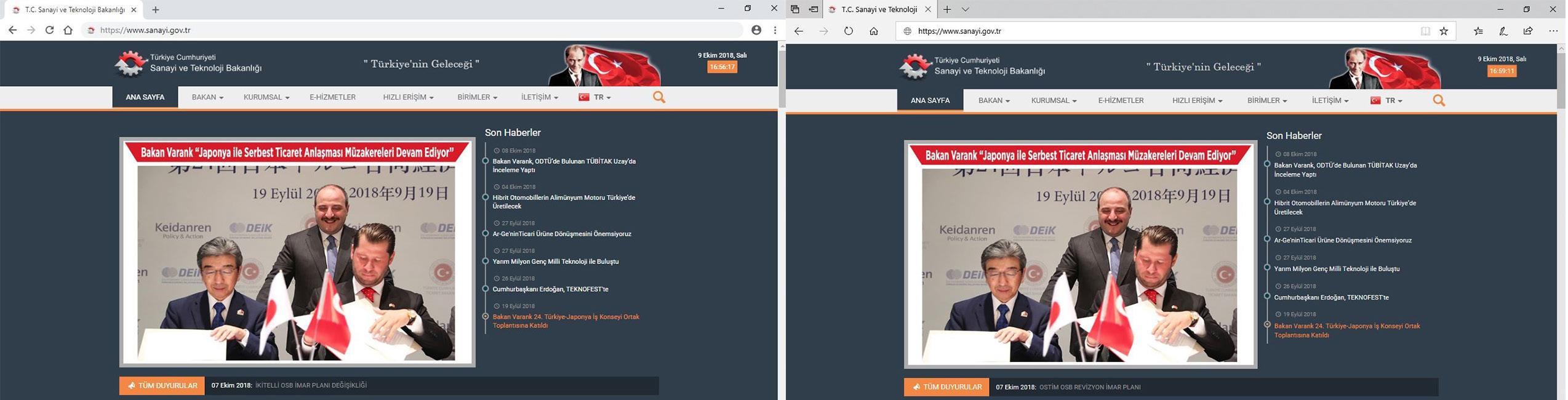
In the example images, the same website is displayed similarly in different browsers.