
KAMİS
Data Entry
Progressive Data Entry
Principle
In forms with lengthy data entries, data input should be designed progressively.
Description
On internet websites, when long forms are used, data entry can be distributed across multiple pages. In such cases, designs that don't exhaust the user and minimize error rates should be preferred.
Guidelines
- Data input fields should be grouped and presented to the user in stages.
- In cases where multiple stages are necessary, information about the number of stages in the form and the user's current stage should be provided.
- In progressive data entry, users should also be able to go back to previous steps for updates. Buttons like "back" or "previous step" should be included for retroactive update processes, and these buttons should be designed to be distinguishable from browser navigation buttons.
- During data entry across stages, users' entered information should not be lost when navigating between steps, and if the information is not being saved, this should be communicated to the users.
- For professional use websites, forms containing vertical scrolling can be preferred.
- The session timeout duration should be long enough for users to comfortably complete all stages, and it should be designed in a way that users are aware of this duration.
References
- ISO 9241-151 / 8.4.13 – Providing a “step back” function
Useful Resources
- –
Significance Level
★★★★★ 4/5
Example
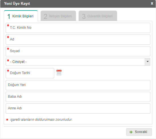
In the example site, data entry has been divided into stages, and users are informed about their current stage and the remaining stages.
Information and Warning Messages
Principle
During data entry, users should be provided with information and warning messages when necessary.
Description
Users should be informed about whether data entry has been successfully completed or not.
Guidelines
- The content of information and warning messages should be free of technical jargon, clear, and understandable.
- Consistent icons for information and warning messages should be used throughout the site, and icons for error and warning messages should be designed in a way that they are not confused.
- Providing positive messages as tasks are completed enhances the user's perception of quality. Especially, positive messages for correct commands can help hide the fact that the software is working slowly, particularly for long processes.
References
- –
Useful Resources
- –
Significance Level
★★★★★ 4/5
Example
In the example site, clear and understandable information messages are provided to users, indicating that they have successfully completed data entry and instructing them on what to do to activate their membership.
Unnecessary Data Entry
Principle
Users should not be required to enter the same data in multiple places.
Description
Entering the same data in multiple locations is not only a waste of time for users but also increases the error rate in data entry.
Guidelines
- Data entry screens should avoid repetitive or unnecessary data entry.
- In cases where the same data needs to be used on another page, the system should be designed to access the initially entered data instead of asking users to re-enter it.
- Default preset values should be used whenever possible.
- Smart suggestion lists should prevent redundant data entry.
- Security validation cases are an exception to this rule. However, even in these cases, users should be informed clearly, and the system should not create the perception of user error or system malfunction.
References
- –
Useful Resources
- –
Significance Level
★★★★★ 4/5
Example
In the example site, some data is requested from users multiple times for verification purposes. To enhance the quality of the user experience, requests for such data should be minimized whenever possible.
Rapid and Easy Data Entry
Principle
In cases where rapid data entry is desired, users can be allowed to enter their information manually rather than selecting from drop-down lists.
Description
In some cases, when designing internet websites, it may be more efficient and preferred to have users manually enter data instead of making selections from drop-down lists. However, it should be taken into consideration that manual data entry can potentially lead to errors, and it should not be used in critical processes, such as reporting.
Guidelines
- To facilitate rapid data entry and prevent errors, all fields should be clearly labeled, and automatic tabulation (auto-tab) should be provided when necessary. Auto-tabulation can enhance performance, but in hybrid environments where users cannot distinguish between automatic and manual actions, it may decrease efficiency.
- To aid in accurate data entry, long information should be broken into smaller sections for input, spelling and grammar errors should be automatically highlighted, and case sensitivity should be eliminated. Since short-term memory can hold approximately 7 pieces of information, long information should be divided into no more than 7 parts.
- Users should also be allowed to use keyboard shortcuts for appropriate tasks.
- In certain scenarios, users should be asked to confirm the information they entered, which can enhance data accuracy.
References
- ISO 9241-151 / 9.5.3 – Providing keyboard shortcuts
Useful Resources
- –
Significance Level
★★★★★ 4/5
Example
In the example site, users are allowed to use the Tab key for moving to the next line during data entry, which assists in rapid data input.
Data Entry Field Labels
Principle
The labels chosen for data entry fields should be explanatory and clear, using words that help users enter the correct data.
Description
Users comprehend the purpose of data entry fields and the type of data they can enter into these fields through data entry field labels. Selecting difficult-to-understand terms for labels can decrease data entry speed and potentially lead to user errors.
Guidelines
- Short, clear and meaningful texts should be chosen for data field labels.
- Label and label components should not be too far away from each other. Label and label components should be grouped so that labels can be easily distinguished from each other.
- When labelling data entry fields, the use of obscure words or commonly unknown abbreviations should be avoided.
- It is recommended to use a colon (:) after data entry field labels.
- Labels should be either left-aligned or right-aligned, and this alignment should be consistent throughout the site.
- Data entry field labels and data entry fields should not compete for visual importance, with labels not standing out prominently, and they should preferably not be in bold.
References
- ISO 9241-151 / 9.5.2 – Making interaction objects identifiable and understandable
Useful Resources
- –
Significance Level
★★★★★ 4/5
Example
In the example site, short and clear labels are used for the data to be entered, and the data entry field for "Date of Birth" is split into relevant sections to help users enter the data in the correct format.
Size of Data Entry Fields
Principle
Data entry fields should be designed to be adequately sized.
Description
It is important for users to see the data they enter into data entry fields. Small text fields or the need to use a scroll bar to view the entire entered data can hinder users from making data entries easily and accurately.
Guidelines
- The length of data entry fields should be proportional to the data that needs to be entered. The presence of a scroll bar within the field does not eliminate this need.
- Use of scroll bars in data entry fields should be avoided as much as possible to allow users to see the data they are entering in one view.
- If there is a character limit for data entry fields, users should be informed of this limitation.
- In fields where character count is limited, users should be shown the remaining character count as they enter data.
- In fields where specific and limited sets of characters are expected, such as Turkish ID numbers (T.C. Kimlik Numarası), users should not be allowed to input data in different lengths or containing characters that are not expected. Similarly, fields that require only letters should not accept numeric inputs.
References
- ISO 9241-151 / 10.6 – Using generally accepted technologies and standards
Useful Resources
- –
Significance Level
★★★★★ 5/5
Example
In the example site, data entry fields are designed to be sufficiently sized, allowing users to see the data they enter.
Design of Data Entry Fields
Principle
When designing data entry fields, the principles of error reduction, increased speed, and improved user satisfaction should be considered.
Description
Data entry fields on websites should be designed according to user needs and habits to allow users to make data entries quickly and accurately.
Guidelines
- In screens where data will be entered, the type (e.g., number, character, etc.), length (e.g., character count, number of digits, etc.), and unit (e.g., hour, meter, etc.) of the data to be entered should be clearly indicated.
- Smart suggestion lists with previously entered data and pre-defined information should be provided to users.
- Radio buttons should be used when only one selection is required, and checkboxes should be used when one or more selections can be made.
- In cases where users make selections with radio buttons, both the button and its label should be clickable. Similarly, checkboxes or text labels should also be clickable.
- In appropriate cases, one of the radio buttons can be designated as the default value.
- For cases where users may not want to select any of the options, the radio button should either be unselected or a "None" option should be provided.
- In cases where users need to make multiple selections, checkboxes should allow independent selection and deselection of options.
- Default values should be provided as fully filled as much as possible and should be easily changeable when needed.
- In drop-down lists (combobox) with more than seven options, list items must be logically grouped or sorted. Consistent grouping improves data entry accuracy and speeds up the process.
- Data entry should use segmentation techniques consistently. Information such as phone numbers and IBAN numbers should be grouped based on general user habits. This consistent grouping reduces data entry errors and increases the speed of memory recall and data entry.
- When a page with data entry fields is first opened, the first data entry field should be displayed as active without needing to be clicked.
- The active data entry field should be clearly marked for the user with a pastel background, a blinking cursor, or similar methods.
- Users should be able to navigate through data entry fields using the TAB key, especially in corporate software, allowing data entry without using a mouse.
- Before publishing, the planned navigation using the TAB key should be checked to ensure the correct order of data entry fields.
- Data entry fields should be designed in a sequence and structure that does not conflict with current user habits.
- For websites with user sessions, populating certain data fields with user information as default values within reasonable security limits can be beneficial.
References
- ISO 9241-151 / 9.5.1 – Choosing appropriate interaction objects
Useful Resources
- –
Significance Level
★★★★★ 5/5
Example
In the example site, radio buttons are used for "Male-Female" and "Turkish Citizen-Other" criteria, allowing users to select only one option.
Consistency in Data Entry Fields
Principle
Attention should be given to the consistency of data entry fields used on websites.
Description
Different designs of data entry fields on different pages can make it difficult for users to understand the data they are supposed to enter. Especially in large organizations, the structures and designs of data entry fields between subunits' pages may differ. To prevent this, it is appropriate for organizations to establish standardized structures and designs.
Guidelines
- For websites with multiple steps or data entry screens, standardized rules and designs for data entry fields should be established.
- The same terms or phrases, such as Submit, Send, Continue, etc., should be used for the buttons used to complete data entry throughout the site.
References
- –
Useful Resources
- –
Significance Level
★★★★★ 5/5
Example
In the example site, a similar design was chosen for two different registration screens to ensure consistency.
Upper and Lower Case in Data Entry
Principle
Users should be able to enter data in both uppercase and lowercase in data entry fields.
Description
Unless there are specific cases, data entry screens should allow data to be entered in both uppercase and lowercase.
Guidelines
- Case sensitivity should be avoided in data entry fields except when necessary.
- In cases where case sensitivity is required for reasons such as password security, users should be clearly and explicitly informed.
References
- –
Useful Resources
- –
Significance Level
★★★★★ 3/5
Example
In the example site, data entry is expected to be in uppercase, and users are informed about this requirement.
Feedback in Data Entry
Principle
During data entry, users should be provided with feedback regarding incomplete or incorrect information.
Description
Feedback is one of the essential components of a usable interface. It should be remembered that users can always make incomplete or incorrect data entries. The fact that errors are inherent in human nature should not be used as a reason to dismiss problems as "user errors." If the system does not provide accurate information to the user about its status, the user may make entries according to their own mental model, and in the end, the user may encounter errors. To prevent the user from developing an incorrect mental model, the user should be informed with accurate and effective feedback. Ensuring correct data entry becomes more important, especially on websites where site security is necessary. In cases where users are not adequately informed, users may think that the system is not functioning.
Guidelines
- For successfully completed actions, messages like "registration process completed successfully" will empower users and keep them in a stronger, more controlled position.
- When incorrect data is entered, feedback should not only indicate that there is an error but also provide information on the cause of the error and how it can be resolved.
- Data format should be verified for accuracy, especially in data entry fields where information such as phone numbers and email addresses are required. Users should be provided with feedback about this.
- When incorrect data is entered, requiring users to fill out all data entry fields again should be avoided. Only the field in which the incorrect entry was made should be filled out again. However, in special cases like preventing security vulnerabilities, users may be asked to fill out all fields again.
- Warning and error feedback should not be confused in data entry.
References
- –
Useful Resources
- –
Significance Level
★★★★★ 5/5
Example
In the example site, error messages are displayed for improperly entered data, and the user is directed to perform the action correctly.
CAPTCHA for Security in Data Entry
Principle
When necessary, CAPTCHA should be used for data entries.
Description
CAPTCHA (Completely Automated Public Turing test to tell Computers and Humans Apart) is a security measure used to protect against spam and password cracking, known as a challenge-response test. CAPTCHA requires users to enter a randomly generated expression, which is presented in a deformed image, in the relevant field. The aim is to prevent data entry from being performed by entities other than real users.
Guidelines
- In CAPTCHA applications, it should be possible for visually impaired users to enter information using sound in addition to visual input.
- Unnecessary use of CAPTCHA should be avoided due to reasons such as slowing down user data entry, potential difficulty for some users in reading characters in the image, and the necessity of continuously renewing and improving security tests.
- Situations where users may make multiple incorrect entries in CAPTCHA applications should be taken into account.
- It is recommended that CAPTCHA be primarily used for initial registration and message sending.
- The fact that using English CAPTCHA can be more challenging for users who do not have English as their foreign language should be considered.
References
- –
Useful Resources
- –
Significance Level
★★★★★ 3/5
Example
In the example site, a CAPTCHA application is used in the form that is required to be filled out for the initial membership process.
Default Values in Data Entry
Principle
In appropriate cases, default values can be defined for data entry fields.
Description
Default values can be defined to expedite user data entry.
Guidelines
- The default value should be selected as the first or last element of the list or the most frequently used element by users.
- In cases where one of the options is selected, some users may forget to make a choice, and the user's preference is saved as the default value. If it is observed that users have such a tendency, it is preferable for the selection fields to appear empty.
- The hint about the possibility of changing the default value should be correct and sufficient.
- In cases where the default value can be accidentally selected, this preference should not be used as the default value, and it should be the first choice in the drop-down list or menu.
References
- –
Useful Resources
- –
Significance Level
★★★★★ 4/5
Example
In the example site, the "Turkey" option, which is considered to appeal to the majority of the user base, has been given as the default value, and users are required to make a selection for other options.
Mandatory and Optional Data Entry Fields
Principle
It should be clearly stated whether data entry fields are mandatory or optional.
Description
Users should be able to easily understand whether data entry fields are mandatory or optional.
Guidelines
- It is preferred to put an asterisk (*) next to the data entry field or add the word "mandatory."
- Mandatory data entry fields should not be hidden behind tabs; data that needs to be entered on separate pages should be continued by clicking the "next" or "continue" button using a "wizard."
References
- –
Useful Resources
- –
Significance Level
★★★★★ 5/5
Example
In the example site, the fields that users are required to fill in are clearly marked with an asterisk (*) symbol.